Back to work
02 — Sage Intacct Mobile

Building a scalable mobile experience from scratch.

Led the redesign of Sage Intacct's mobile experience, transforming a limited, outdated timesheet app into a scalable, multi-module product. Established the foundation for a mobile design system while delivering core workflows for time tracking and expense management.

Product
Sage Intacct Mobile
Scope
Mobile app redesign + design system foundation
Role
Product Designer
Team
PM, Engineering, Visual Designer
Sage Intacct Mobile home screen with quick actions and to-dos.
Active time card screen showing clocked-in status, breaks, and project details.
Expense report screen with line-item receipts and submit action.

Three core surfaces of the redesigned app — home, time tracking, and expenses.

The problem

A mobile experience that wasn't built to scale.

Intacct's mobile experience was inherited from an acquisition — a legacy timesheet tool with no foundation to grow on.

  1. 01 The existing app was a holdover, disconnected from the platform
  2. 02 It lacked consistency, structure, and reusable patterns
  3. 03 New features were difficult to add without increasing complexity
As a result
  • The experience felt fragmented and outdated
  • There was no foundation for future growth
  • Mobile UX varied significantly across features
Legacy timesheet app with a dark active timer panel and dense list of time entries below.
Before The legacy timesheet app — visually inconsistent, dense, and disconnected from the rest of Sage Intacct.
Context

From a supporting tool to a core product surface.

The product strategy was expanding mobile beyond a single timesheet workflow. That meant handling multiple features — time, expenses, approvals, and more — designing for both employees and managers, and creating a system that could scale across future modules.

Core challenge

Designing the product and the system that would carry it forward.

The team was initially focused on delivering a functional mobile experience for immediate use cases, but I saw that without a foundational system, each new feature would introduce more inconsistency and technical debt. I advocated for establishing a design system and scalable patterns before expanding features — aligning the team around a longer-term, system-first vision.

That meant we needed to simultaneously:

All at once
  • Design a cohesive mobile experience from scratch
  • Repurpose existing timesheet functionality into a better UX
  • Introduce entirely new workflows (time tracking, expenses)
  • Establish a scalable design system for future growth

All within a small, fast-moving cross-functional team.

Defining the approach

Systems over screens. Patterns over one-offs.

We weren't just designing features — we were defining how mobile UX would scale across the product. That required thinking beyond individual screens and focusing on systems over one-off solutions, patterns over custom designs, and scalability from day one.

Key insight
We weren't just designing features — we were defining how mobile UX would scale across the product.
  1. 01
    Defining MVP scope

    Aligning on what to ship first.

    I worked closely with PM and engineering to identify the most valuable features for launch, align on user journeys across roles (employees, managers), and map end-to-end workflows like clocking in/out and submitting expenses.

  2. 02
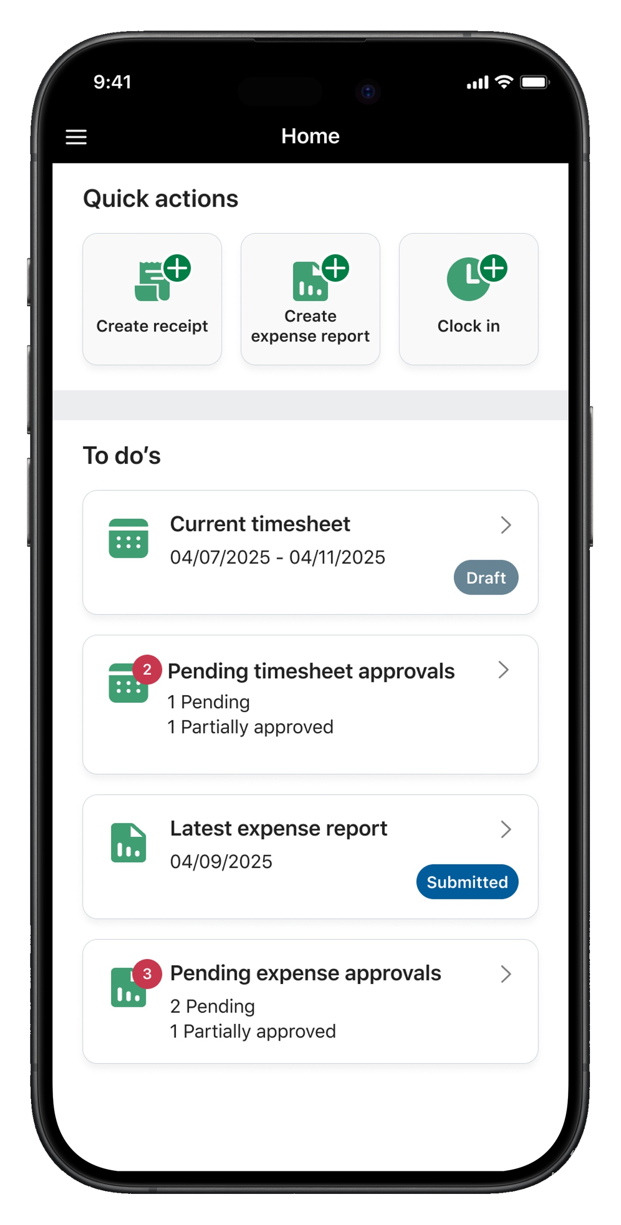
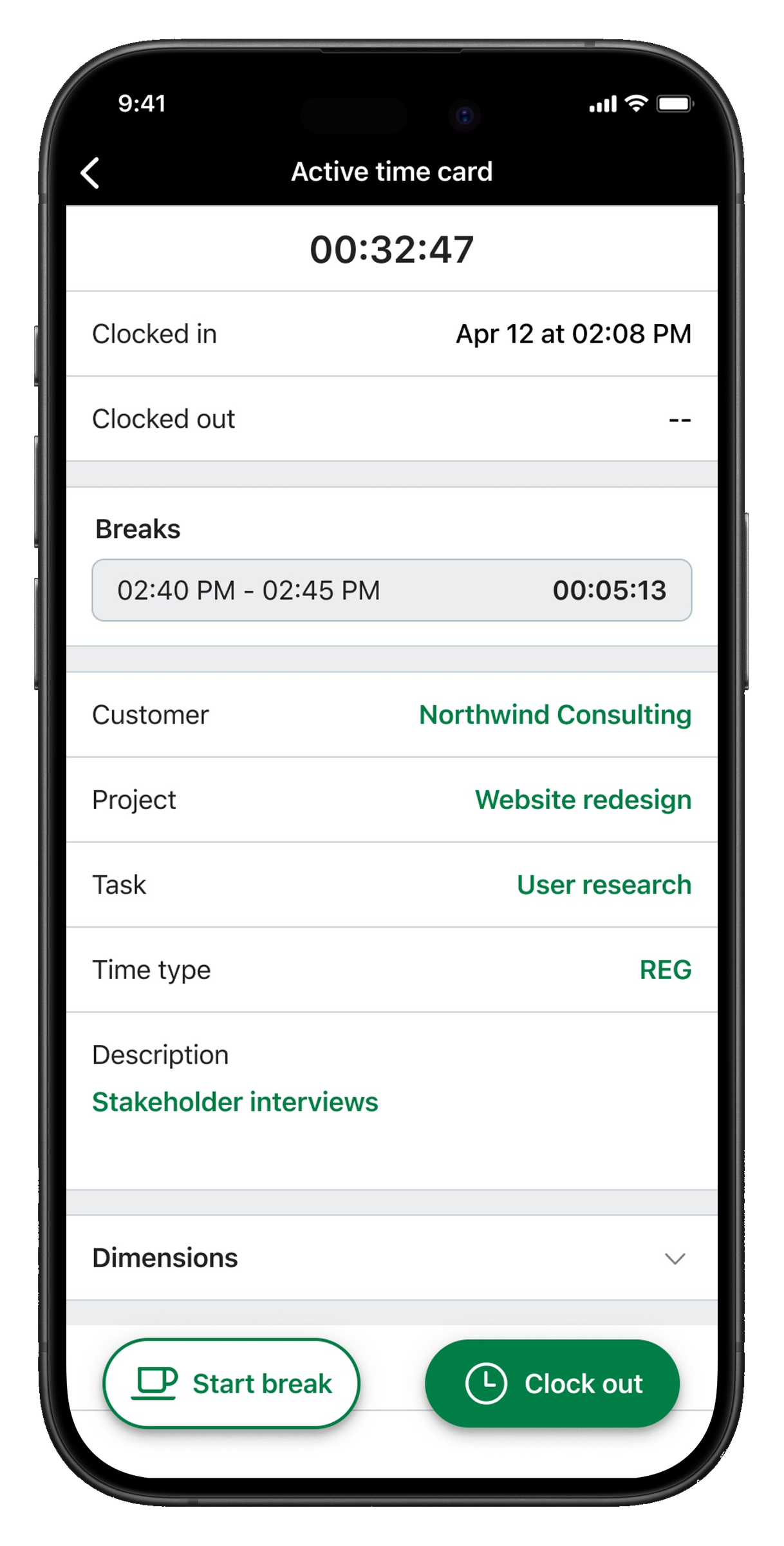
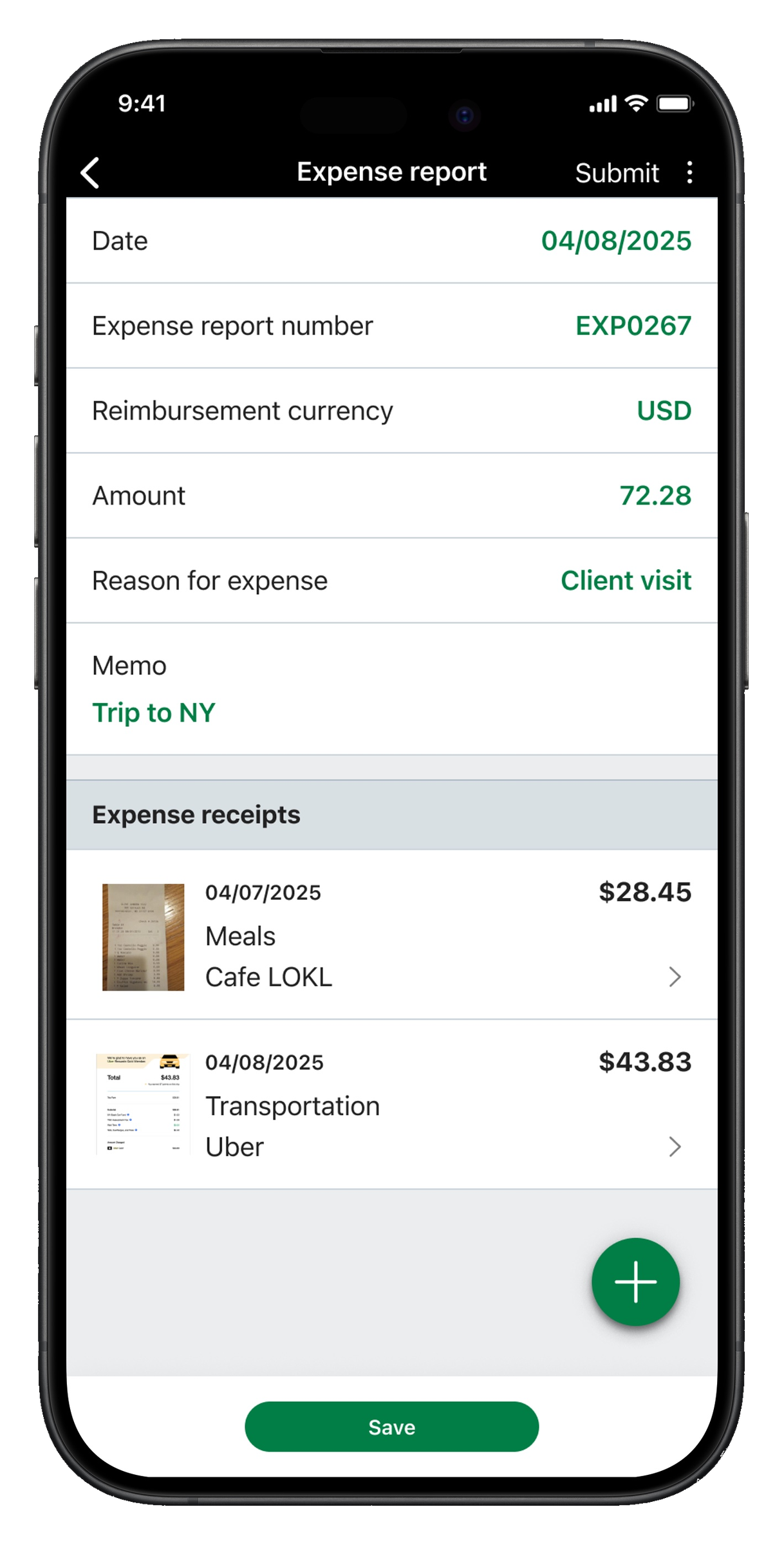
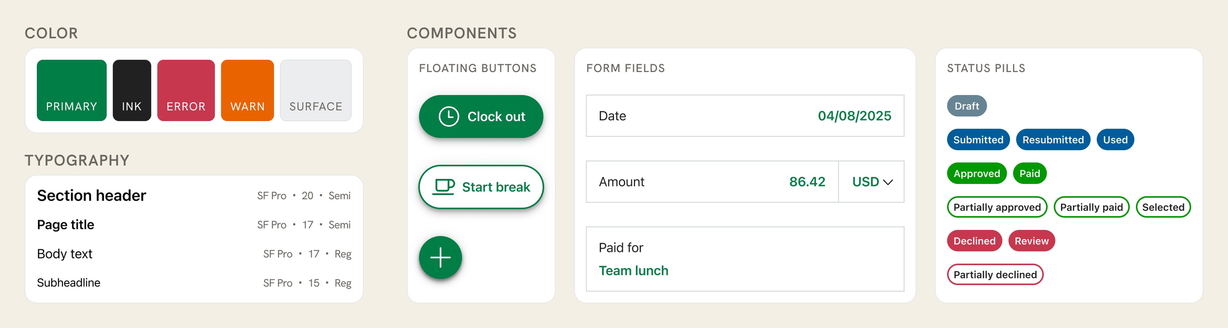
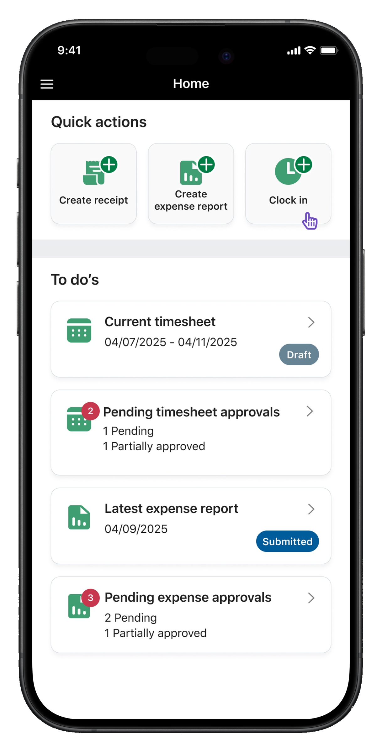
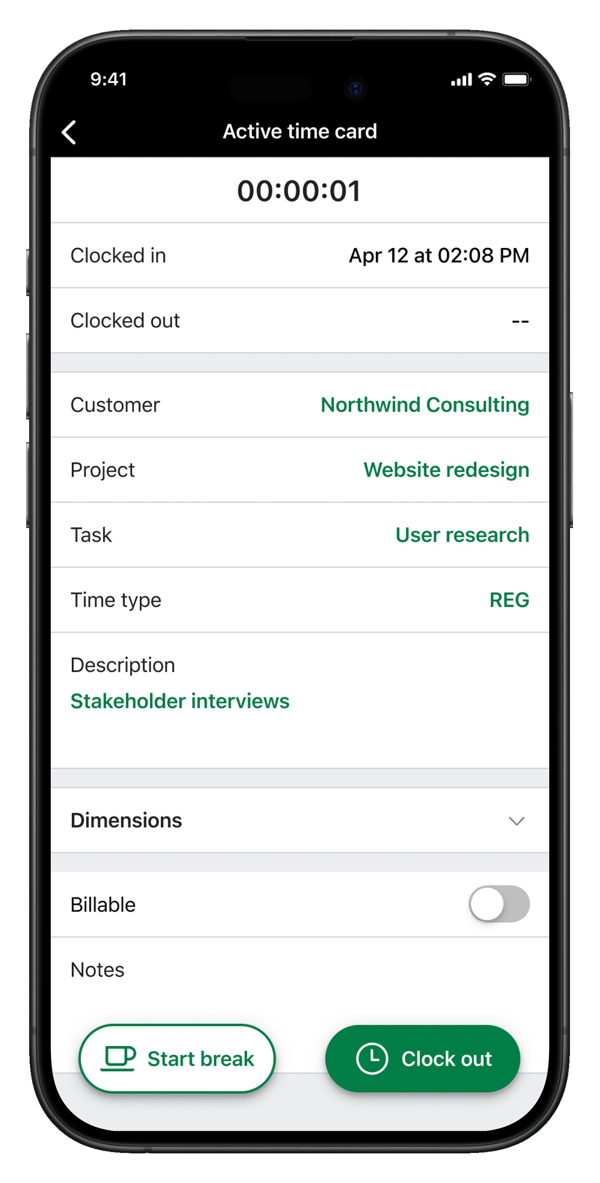
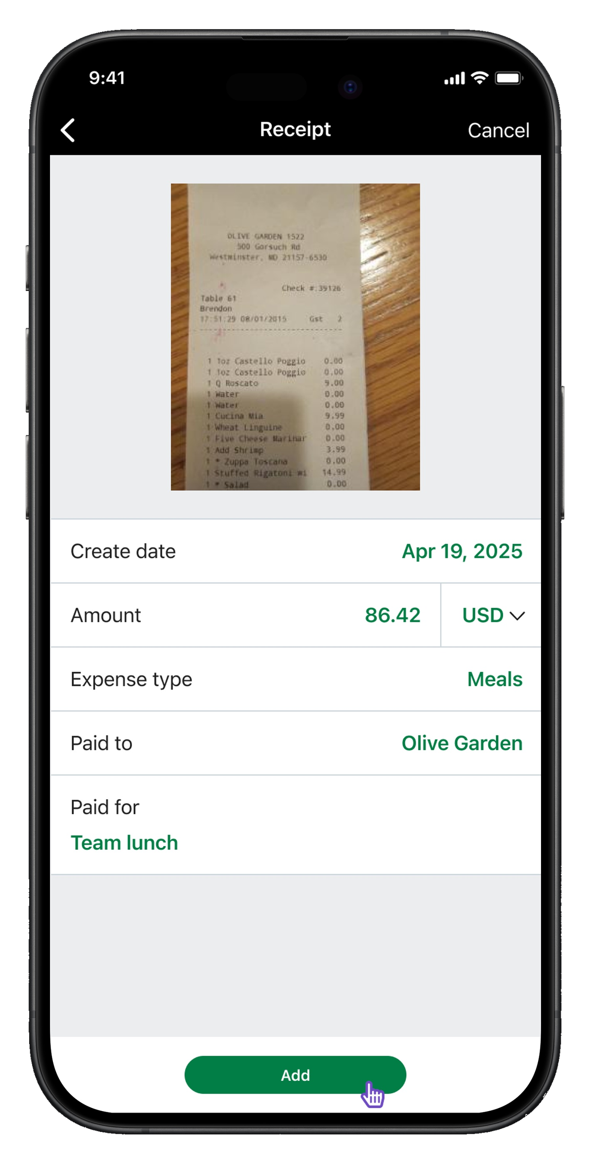
    Building the design system

    Standardize the language. Design for scale.

    Before designing features, I defined two guiding principles: standardize the design language to ensure consistency across all modules, and design for scalability by creating patterns that could support future workflows. With those in place, I collaborated with a visual designer on color, typography, and spacing; reusable components with defined states (buttons, inputs, lists, cards, dropdowns, search, filters, empty states); and navigation and interaction standards. Everything was documented in Figma so the team could extend it consistently.

  3. 03
    Designing core workflows

    Time tracking and expenses, end-to-end.

    With the system in place, I designed the key user flows. Time tracking covered clocking in and out, viewing and managing shifts, and handling breaks and time edits. Expense management covered capturing receipts, creating and editing expenses, and submitting for approval. Each flow was designed to minimize friction for repeat actions, stay clear and intuitive on mobile, and reuse patterns from the design system.

Solution

A unified app, built on a scalable foundation.

The work resolved into three connected outputs: a unified product, the system underneath it, and the workflows it enabled. Each shipped together, but each carried a different kind of weight — strategic, structural, and experiential.

01

Unified mobile experience

The product

Combined time tracking and expenses into one cohesive app with consistent navigation and interaction patterns. What was previously a single-purpose tool became a multi-module surface — one entry point, one mental model, one set of rules.

02

Scalable design system

The foundation

Reusable components and patterns, clear guidelines for future development, and a foundation for long-term product growth. These became the building blocks for every screen that followed.

Design system Sage Intacct Mobile
Design system specimen showing color tokens, typography scale, floating buttons, form fields, and status pills.
A foundational specimen — color, typography, components, and status patterns documented as the building blocks for every screen that followed.
03

Mobile-first workflows

The experience

Designed specifically for mobile contexts — simplified complex tasks into focused flows, reduced cognitive load for everyday actions, and reused patterns from the system at every step.

Workflow A

Time tracking

Home screen with the Clock in quick action highlighted.
01 Tap Clock in from a quick action on the home screen.
Active time card screen showing clocked-in status, project details, and clock-out action.
02 Land directly on an active time card — full context, no extra steps.
Workflow B

Expense management

Receipt capture screen with photo, expense type, and paid-to fields.
01 Capture a receipt and categorize it on the spot.
Expense report screen showing the new receipt added as a line item.
02 The receipt flows into an expense report, ready to submit.
Outcomes

What we shipped, and what it enabled.

  • Delivered the first unified Sage Intacct mobile experience, replacing a legacy timesheet tool with a multi-module product covering time tracking and expense management.
  • Built the foundational mobile design system from scratch — 24 components and patterns across 3 modules — that became the building blocks for all future mobile work.
  • Established the scaffolding for future modules (approvals, reports, dashboards) to be added without reintroducing fragmentation.
  • Improved consistency across features and set a shared UX standard for the cross-functional team.
Reflection

What worked, what I'd change, and what stuck.

What worked well
  • Designing system-first instead of feature-first.
  • Strong cross-functional collaboration.
  • Balancing speed of delivery with long-term scalability.
What I would improve
  • Introduce usage analytics earlier to validate decisions.
  • Further tailor experiences for different user roles.
  • Expand system documentation for broader adoption.
Key learning
Building for scale requires designing beyond the immediate problem. By focusing on systems and patterns early, we created a foundation that enabled the product to grow without sacrificing usability.